ThriveAlive.Ai turns expert frameworks into guided conversations. People were leaving before they tried one, so I rebuilt the landing page and designed the product experience behind it.
ThriveAlive.Ai is a personal and professional growth platform that helps people work through big decisions using frameworks built by real experts. Getting that kind of guidance is usually expensive or hard to access, and generic chatbots tend to give shallow, one-size-fits-all answers.
It closes that gap with structured modules that turn a reflective conversation into a usable outcome you can download and act on.
As the designer on the product, my focus was making the experience feel thoughtful, human, and supportive, while keeping it easy to navigate so users always knew where they were and what they'd walk away with.
I owned the UX and UI end to end, from research and information architecture through to the final interface design.
I worked closely with the founders to understand the product's purpose, mission, and vision, as well as the non-negotiables: flexibility, authenticity, and a human touch. This shaped the foundation for every design decision that followed.
At the time, ThriveAlive.Ai followed a simple linear flow:
homepage → login → session → exit.
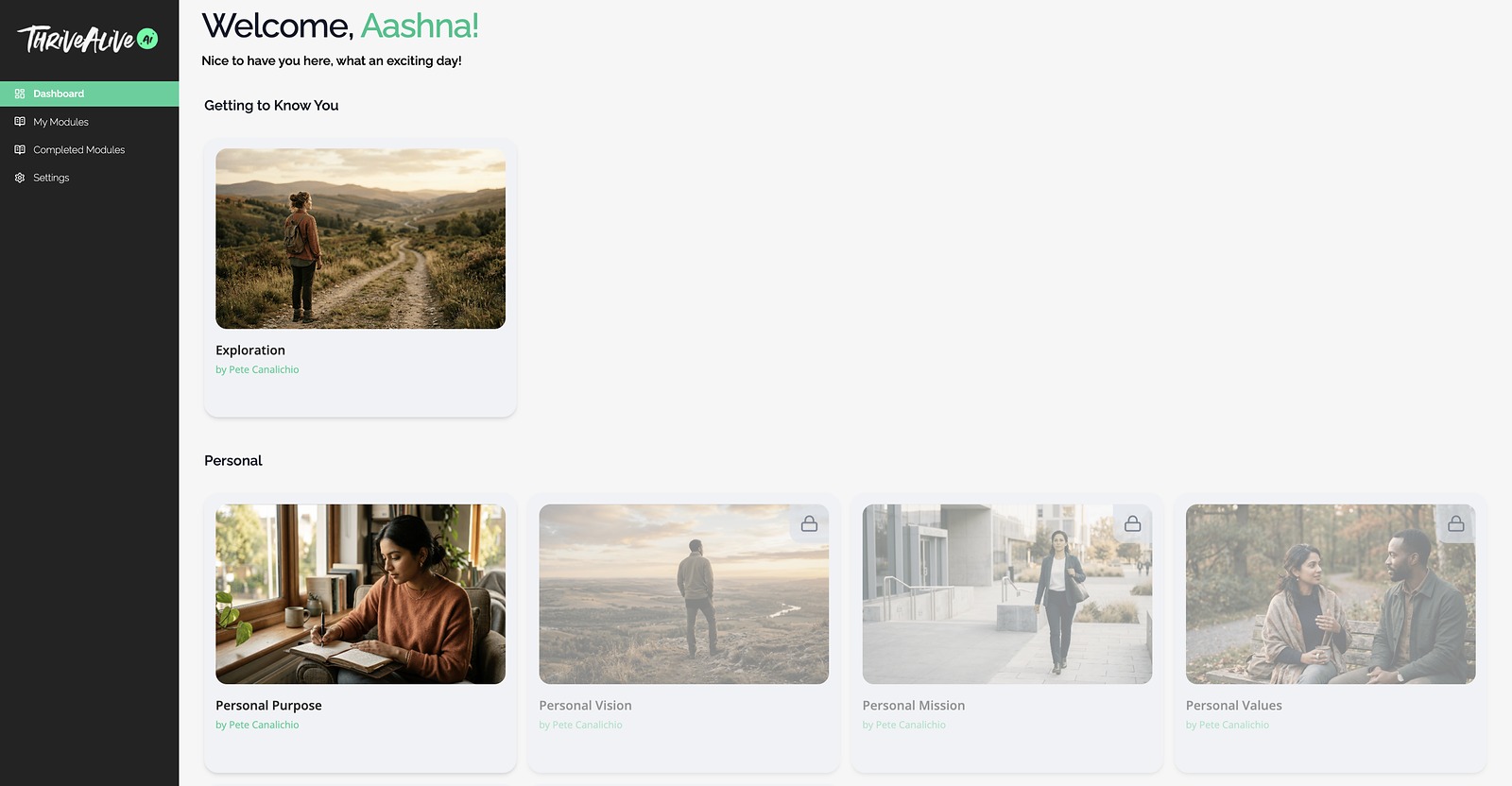
There was no dashboard, no sense of progress, and nothing to guide users once a session ended.
In our first call, the founders told me that people were interested in the concept but many were leaving the homepage before trying a module. The problem wasn't the idea, but how well the experience communicated its value, built trust, and pointed people to their next step.
I looked at the products closest to ThriveAlive.Ai.
None of them sequence expert frameworks into connected modules that each end in a downloadable outcome, so the landing page had to be designed rather than borrowed.
People were leaving before they tried anything, so I asked what I would want to know arriving cold: what is this, how does it work, can I trust it, how do I start. Those four questions, in that order, became the structure of the page.
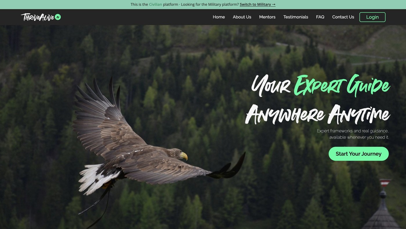
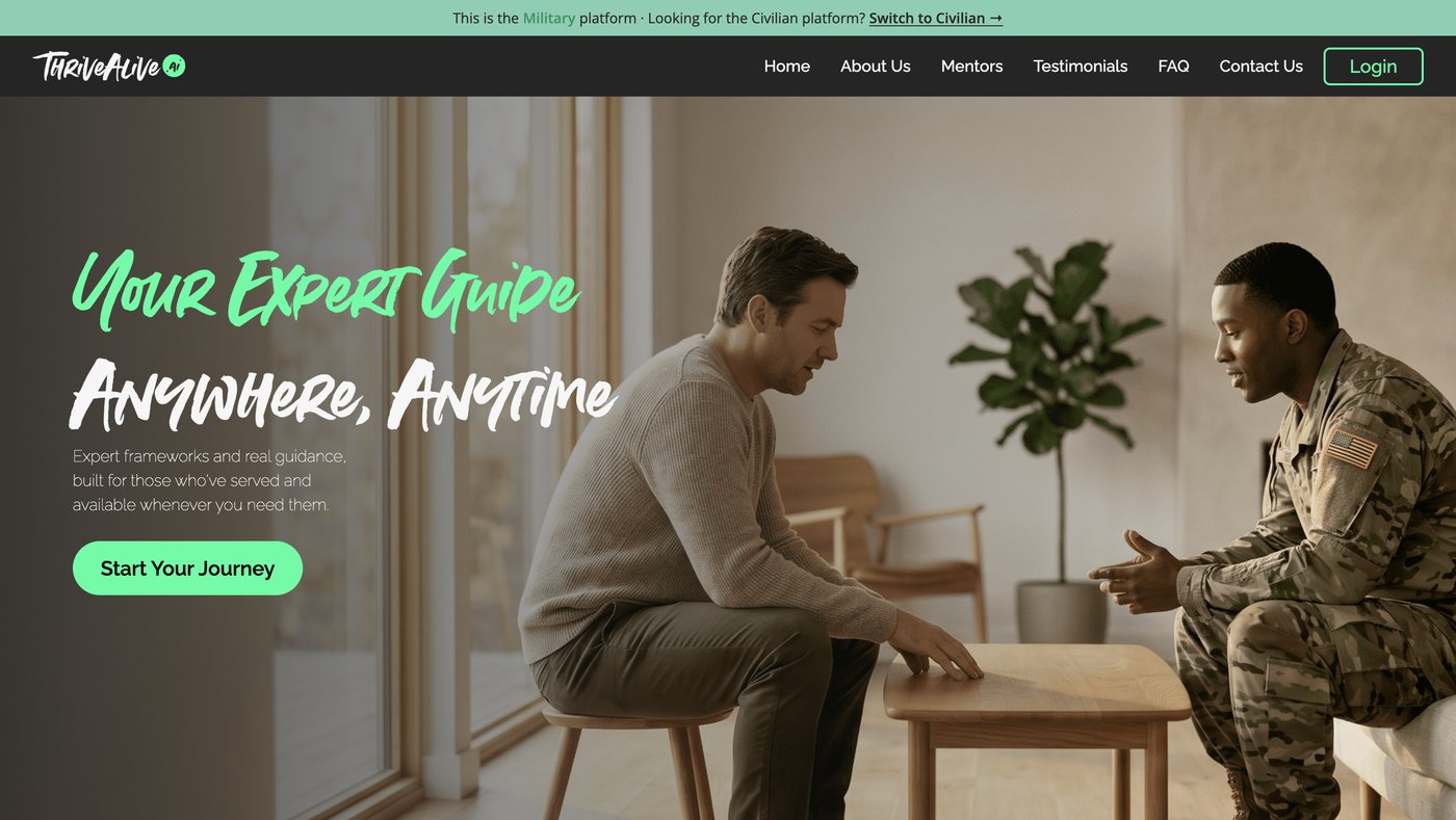
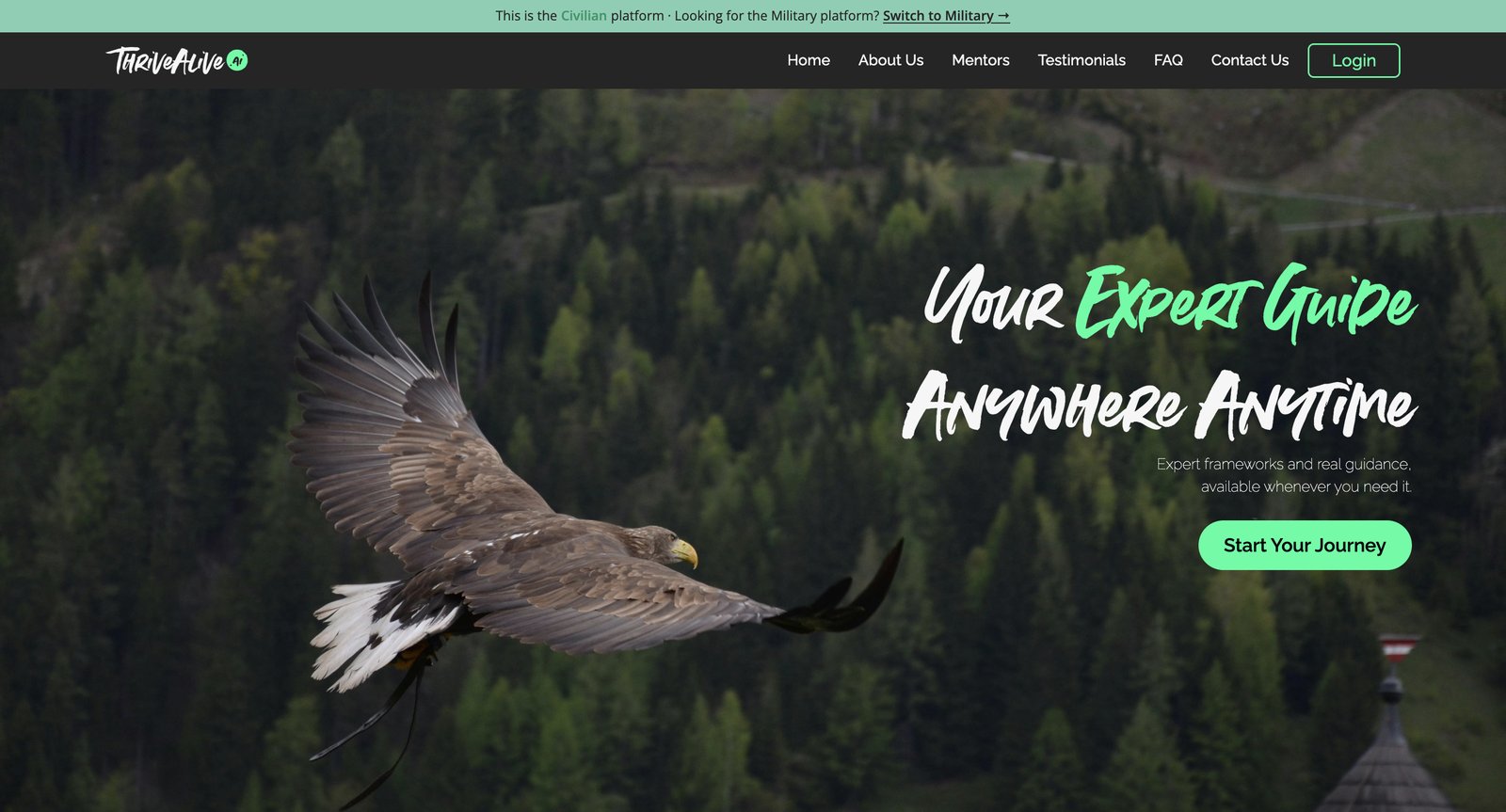
ThriveAlive.Ai serves two very different users: a civilian exploring growth, and someone leaving service working through a specific transition. The old landing page only spoke to the first. One page covering both would have to generalise until it spoke clearly to neither, so I built two, on the same four-phase structure.
Separating the audiences creates a new risk: someone lands on the page that doesn't fit. There are two ways across.
Veterans and civilians sign in to the same dashboard and move through the same flow. The modules differ: the military set is written and structured for someone leaving service. One system, two libraries.
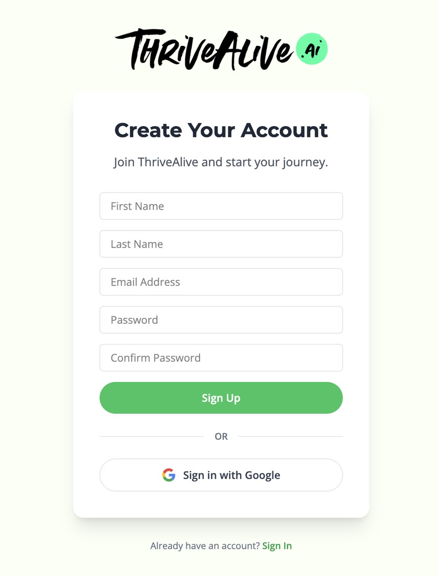
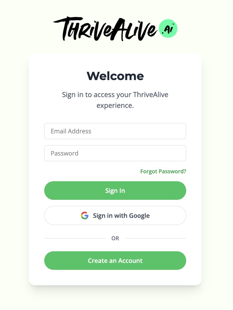
Pressing "Start your journey" hands the user off to the product itself. I designed the flow to carry them from sign-up to a downloadable outcome without losing momentum or a sense of where they are.
Select a shaded step to see it. Plain steps have no screen of their own.
A couple of modules are free, so most people reach a real session before paying. If they like it, they can unlock the rest through Stripe checkout.
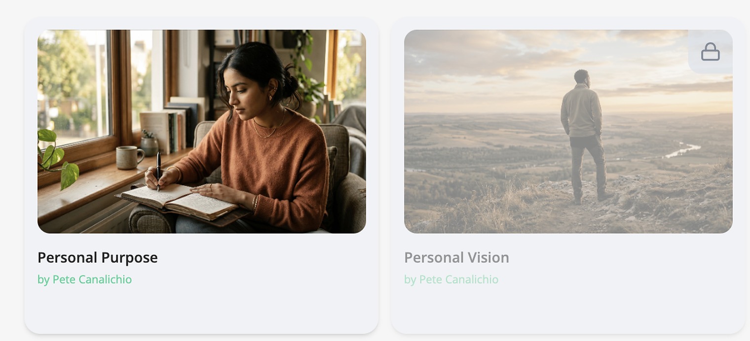
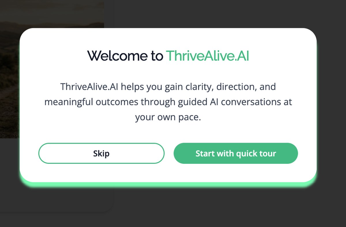
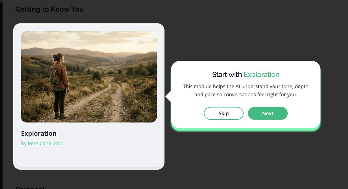
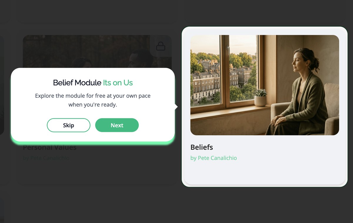
In testing, 4 of 8 reached the dashboard and hesitated. The modules connect to each other, so the order matters, but nothing on the screen said so. New users are offered a short guided tour with a recommended starting point. It can be skipped at any time.
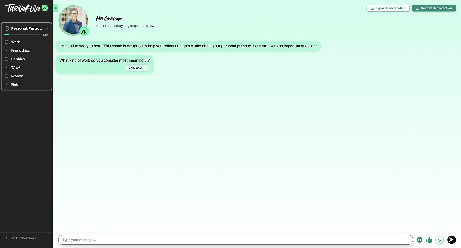
A guided conversation: steps on the left, the session on the right, worked through in order.
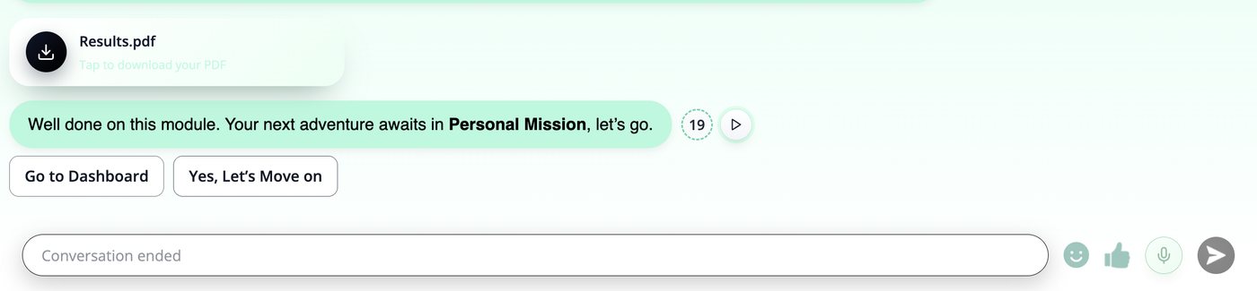
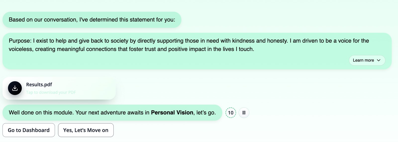
In testing, 5 of 8 finished a module without knowing which one came next, or that the modules connect at all. Every module now ends with a downloadable, actionable PDF and a recommended next module.
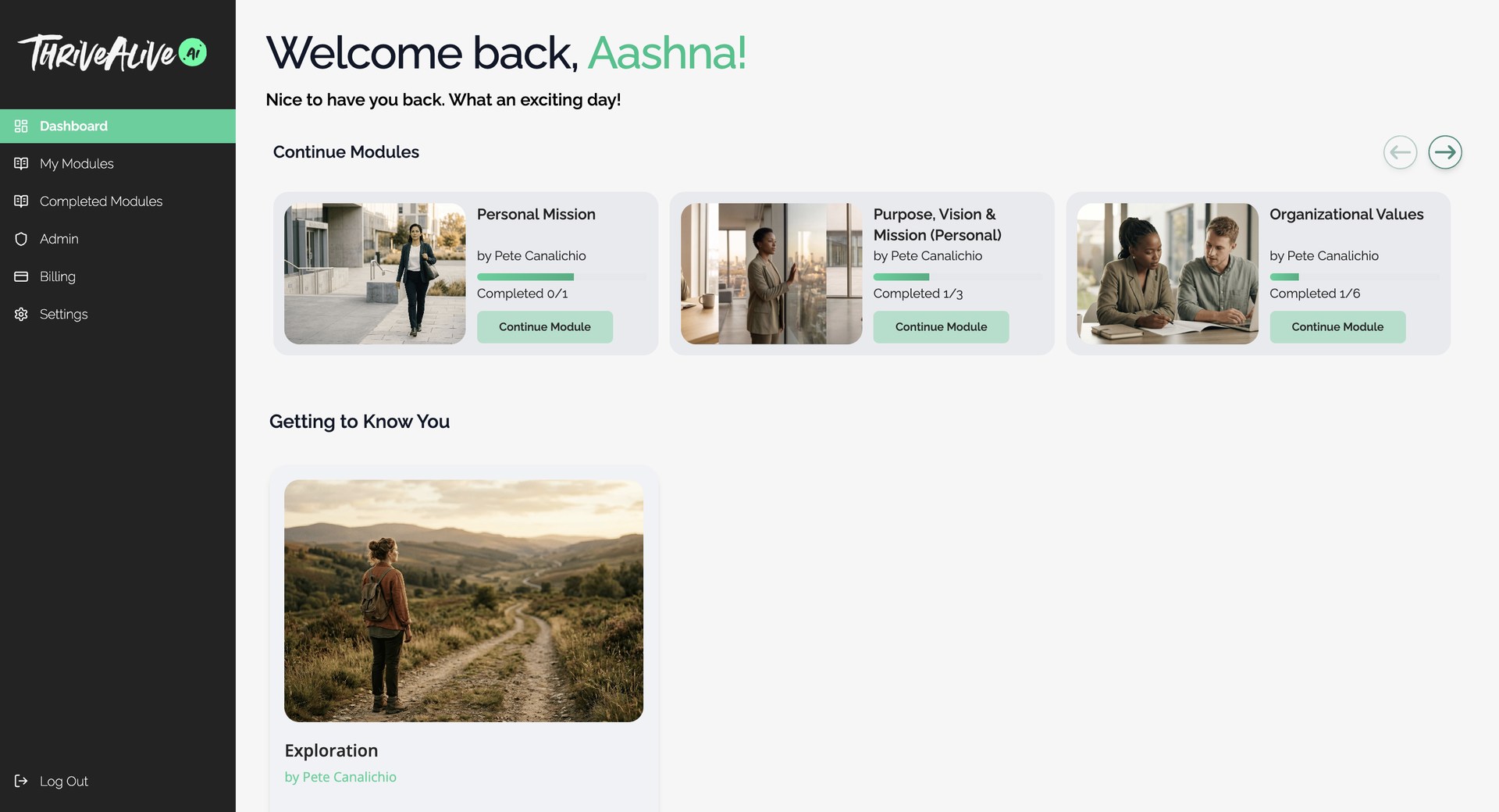
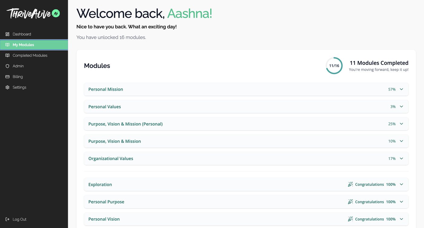
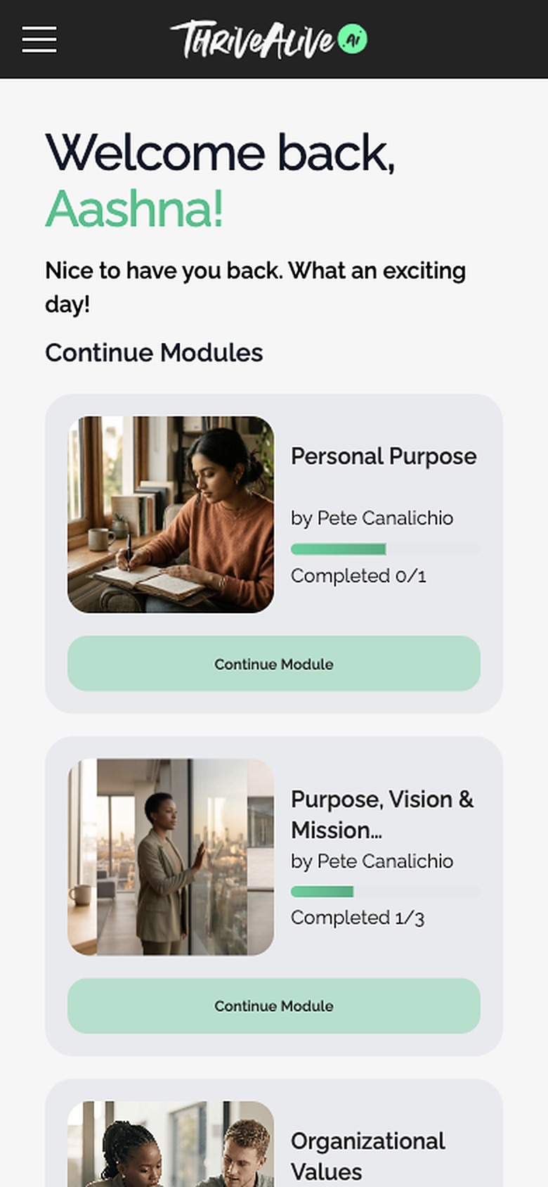
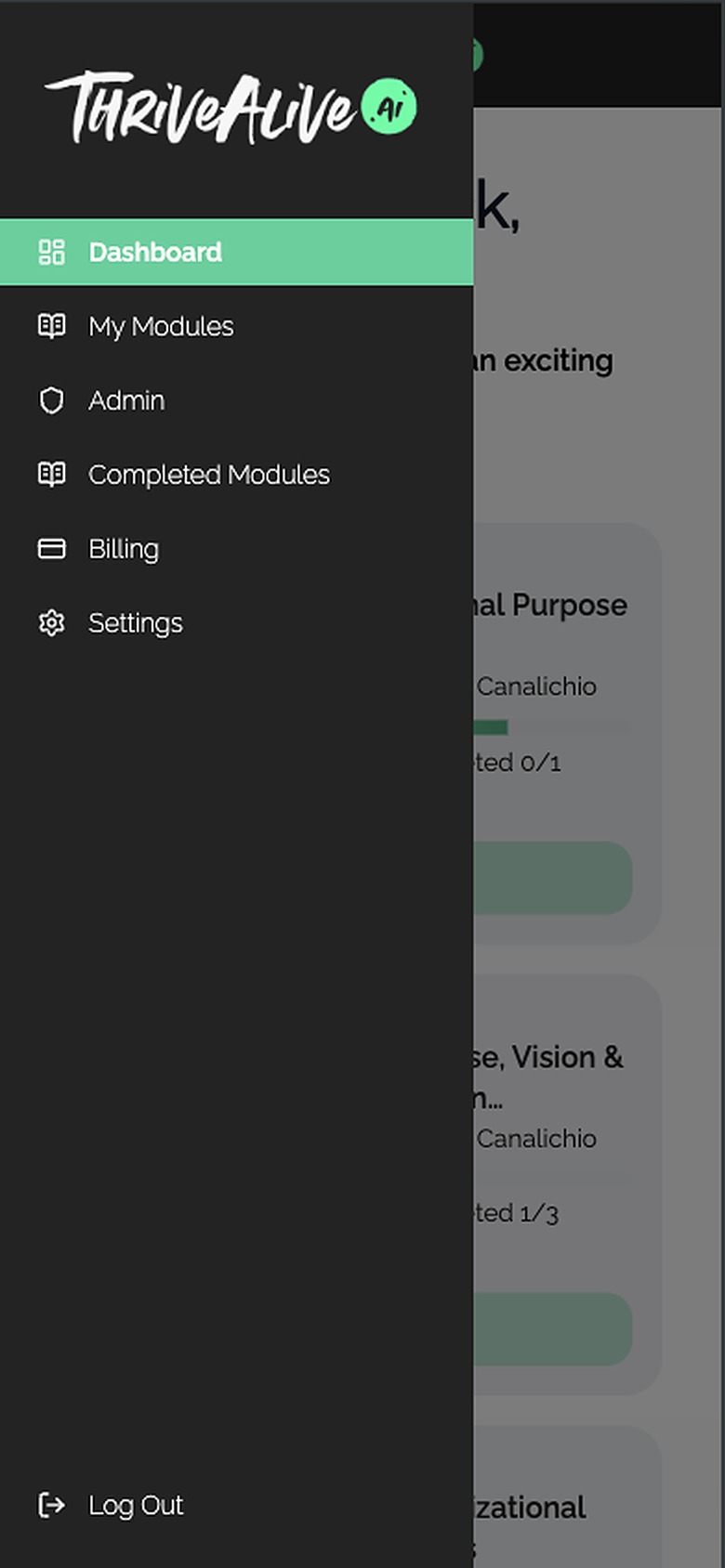
Not everyone finishes in one sitting. If someone leaves mid-module, it moves to a "Continue Modules" row on the dashboard, so the module they stopped in is the first thing waiting for them. A dedicated My Modules page tracks progress across everything they've unlocked.
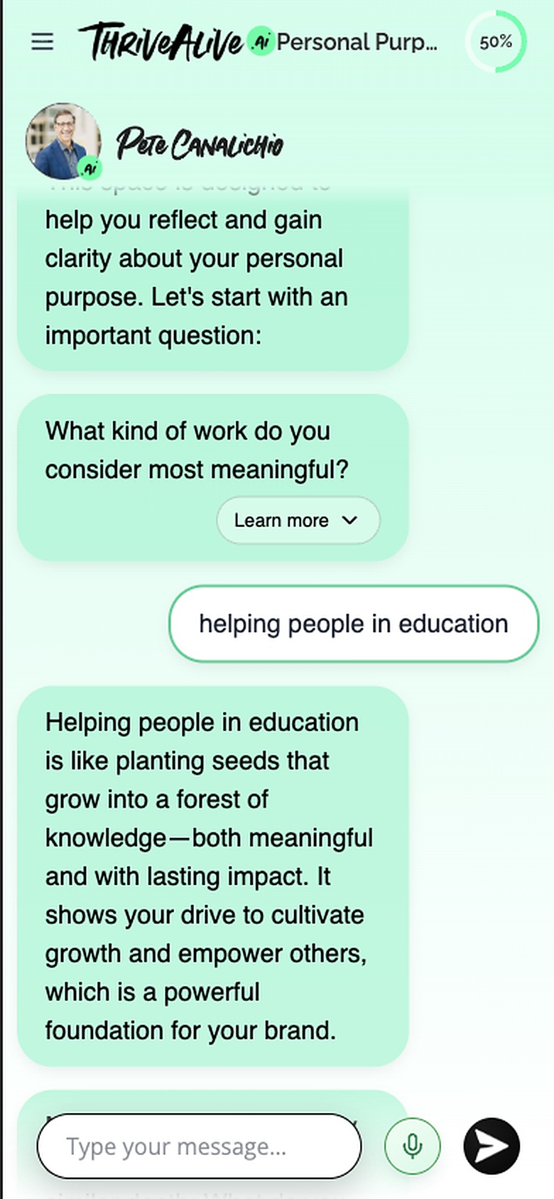
The session is where the product actually happens, and it is a conversation. That puts weight on small decisions: how you answer, how much text arrives at once, what the product does while it thinks, and what happens when something breaks.

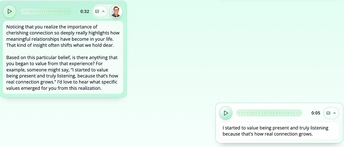
A mic in the message bar switches voice on. Users can talk, the mentor replies in his own recorded voice, and every message keeps a transcript for accessibility.

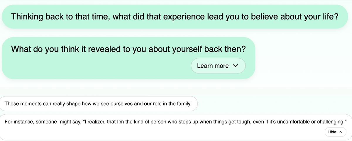
These conversations go deep, so answers can run long. Dropping all of it into the thread at once leaves people feeling lost, so the extra detail sits behind a Learn more button.

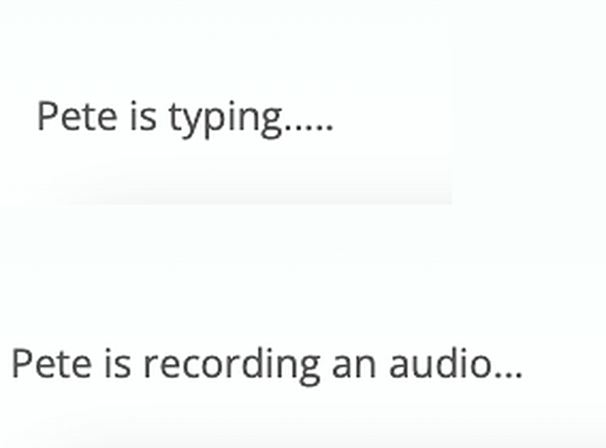
A reply takes about five seconds, and silence reads as something broken. So the wait says what is coming: the mentor is typing, or the mentor is recording an audio.

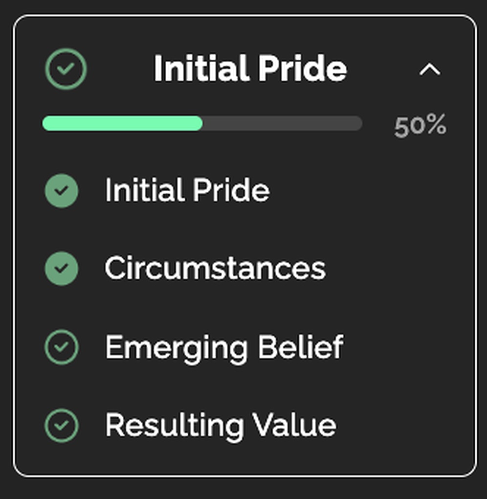
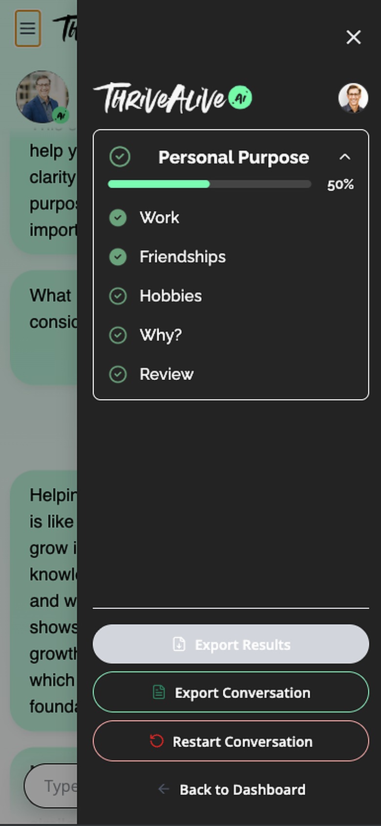
A module is long. The side navigation bar lists every section with a progress percentage, so users can see where they are, what is still ahead, and how much is left.

A finished module leaves an actionable PDF and a suggested next step, with buttons to go back to the dashboard or open the next module. If they choose neither, the countdown moves them on.

Exporting keeps the conversation word for word, the user's answers alongside the mentor's. Restart is there for anyone unhappy with how it is going; it wipes the module, so it sits behind a confirmation.
The side navigation bar collapses behind a hamburger and opens as a full drawer, keeping the steps, the progress and the session controls. Progress moves into the header as a ring, so how far in you are stays on screen.
Once a first version was live, feedback came from two places. I pulled both into one list, fixed the main issues that kept coming up, and tested again with a new group.
Over Google Meet, against the staging build. A scenario at each step, watching and asking only when someone stopped.
Friends rather than recruited users, and none of them veterans. Testing with veterans is in progress.
Completed at the end of the pilot programmes, by people using the product for real.
A survey captures what people say, not what they did.
More came up than I acted on. These three were stopping people from getting through the flow.
Retested the same scenarios with 5 people who had not seen it before. All 5 moved through the landing page and the dashboard without the hesitation I had watched the first time.
The redesign is live and is now the product the team takes into conversations. It runs as B2B pilots rather than being open to the public, so there is no consumer funnel data yet. The number I would want first is landing to first session, because that is the problem this started with.
I'm Aashna, a UX/UI designer working on products where the hard part is helping people understand where they are and what to do next. If you'd like the longer version of any decision here, get in touch.